Showing posts with label alcohol inks. Show all posts

Sunday, 6 July 2025

Wanderlust 2025 - part two

I've completed the second part of the online art journaling course that is Wanderlust and the themes this time were Personality, Feelings, Senses.  I have picked my favourite pages or the pages I most enjoyed making to show you.  Above is a linocut printed face from my imagination (we could choose our own face, but I decided that wasn't something I wanted to include) together with some resist watercolour patterns, some stamping and some stitching.  I really liked the stitching and have used it in other pages.  I also would like to use it in some other mixed media pieces which are going round my head at the moment.
For this one, the teacher was focusing on the colours of lakes and streams, but as it was allium time in the garden, I focused on the colours I could see there.  The watercolour circles with different techniques - wet on wet, wet on dry etc. are strung together and make a hanging decoration, should you want to do that.
I enjoyed using the bright colours in this page which was fun to make.
You'll see more of the stitching here. The background technique was messy but really fun as it was all about adding different media to tissue paper, including gesso, watercolour, acrylic ink, colour burst/pixie powder/infusions (water soluble dye powders some with added mica or walnut ink), alcohol ink. They were left to dry and then scrunched up, smoothed out then wrinkled as pieces were glued down to provide some texture.  It was very freeing.  The pocket on the left includes a tag covered with the tissue paper really smoothed out and a colour swatch piece that was hanging about.
This page was made in the teacher's style (Dyan Reaveley).  Bold colours, big shapes.  It is quite a textured page as the strips on the trees are collaged on, the trunks are embossed, the flower centre is sticking up and has a button in the middle, and the blue heart is card embossed with ultra high embossing powder (several times) and then stamped into while still warm.  The two hearts in the trees are covered with 'Glossy Accents' which is a product that dries to a resin-like finish.
Finally, here is a portrait of someone.  In the lesson, she was described as a 'forager'.  We had to make leaves from gel printed tissue paper or tracing paper, or copy paper.  Before I collaged the leaves on, I showed Chris the watercoloured face and he said she had a look of a 'Svetlana', someone from Eastern Europe.  The face is created using layers of watercolour in a single shade, then a bit of coloured pencil. I turned 'Svetlana' into a forest goddess, with her leaf costume.  
I wonder what the next twelve weeks will bring.

Thursday, 3 November 2022

Wanderlust 2022 - weeks thirty-six to forty-two - Inks

I thoroughly enjoyed exploring Inks in Wanderlust.  We began with Distress inks, making a background and then using tea bags and photos to create linked images, showing elements of our personalities.  I chose to put a photo of my Granny and my Mum in the teabags and a stamped image of a woman to represent me - Granny gave me a love of nature and gardening and Mum gave me a love of music.  
We used acrylic inks for our next piece. We made lots of patterns using inks and blowing through straws. we then tried to bring out something we could see in the pattern.  I eventually decided I could see part of a face, so brought it out using watercolour pencils.  I think it is quite enigmatic!
Acrylic ink painted onto feathers was our next lesson.  I made envelopes and placed some family photos in them - my Mum and Dad on the left and my Granny and her family on the right with a small photo of Dad as a little boy in the middle. I have used these before, but they are great photos.
Another inky background.  This page took a totally different turn from how I thought it would be.  It ended up being a memory of Scruffy, our cat who we lost at the end of August.   I painted Scruffy in acrylic ink using a photo for reference.  The autumnal colours and leaves just seemed to work with the theme.  The two ghostly cats in the corner represent the other two who are buried in the garden, Gonga and Ginny.    
This was about using loose brush strokes, holding the brush right at the end and Acrylic ink. It is vaguely based on a self portrait but doesn't really look like me, although that wasn't the idea anyway.  Not one of my favourites, but an interesting process - letting go of perfectionism!
Much more to my liking was this layered page, using spray inks, stamps, stencils and a magazine focal image.  I like the feeling of movement with the leaves and the woman's hair. This also included a useful lesson on colour theory, so that we wouldn't make 'muddy' colours (unless we wanted to use neutrals, of course).
The last in the inks section was using alcohol inks and stencils.  I used Yupo paper (synthetic paper which doesn't absorb the ink) for the image on the left and glossy card for the one on the right.  I wasn't happy with the tissue paper image on the right as the tissue paper didn't fade into the image as it should have done. Possibly this was to do with the alcohol background.  So, I had another go... 
I kept the original which is now hidden under the flap on the right. This time I used alcohol inks and stencils on my gel plate.  I think this worked much better and the tissue paper faded as it should do.
The last theme for this year is Paper and Fabrics, which should be good.

Monday, 11 July 2022

Index-Card-a-Day Challenge (ICAD) 2022 - Week 5

Week Five of the challenge brought: Neon; Magical (a 'Galaxy' background with distress inks, white splatters and sparkly Stickles); Postmark...
...Sky (watercolour sparkle inks and a stamped image); Quatrefoil or Ogee; Rooster (collage made using some of my clean up sheets) and Yellow (using alcohol inks).

On to Week Six...

Saturday, 17 April 2021

Wanderlust 2021 - weeks thirteen to sixteen - Silhouettes

I am so pleased I signed up to Wanderlust this year as it is bringing me a lot of joy.  I am loving using different techniques and media and learning a lot.  Week thirteen was about using a gel plate to manipulate a print and image, adding colour to it to look a bit like an Andy Warhol silk screen print.  The second technique was tracing over the image and then blotting it carefully on another piece of paper, then painting it in. Both of these techniques were new to me, so it was a learning experience.  I think the end result on the right is more Matisse than Andy Warhol though!
Week fourteen was one where I needed to take my time.  We had to choose an image of a tree.  I did look through my photos, but none appealed so I went on a free images site (unsplash) and found the one above.
We created a watercolour background and then added the tree in white gel pen.  It was a very calming activity.
The words were found in a book - I looked in Dickens and a book on forestry, thinking either of them would be perfect, but no luck.  I then looked in a Hammond Innes thriller (The Trojan Horse) and these words just jumped out at me. Serendipity was certainly working for me!
Week fifteen was about alcohol inks on a gel plate, or a brayered background which then had a silhouette placed on top.  I used some die cuts as my silhouettes.  The alcohol ink background is on the left, the brayered one on the right.  The alcohol ink background has a stencilled tree hiding behind the die cut and the  brayered background has stencilling and stamping added to it, with a bit of doodling for good measure.
I enjoyed using the alcohol inks on the gel plate so much, I made a couple more prints.  I should have worn my gloves though, as I manged to get very inky fingers and they are only just clean again (despite copious amounts of hand washing!)
I made myself choose warm colours for week sixteen.  I really enjoyed this class.  We used a baby wipe to apply the background colours, then stencilling and stamping, and added doodling.  Stencils and masks were the focal points.  

Recycling is the theme for the next four weeks.  I'm so looking forward to it!

Tuesday, 26 January 2021

Wanderlust 2021 - the first four weeks - Reflections

I am well into my mixed media art journaling course and am loving it, even when it is a real challenge.  I will post about it once a month, as the course is split into monthly sections, each with a theme.
The theme was Reflection.  For week one, it was to think about a positive feeling from last year.  I chose 'being calm when surrounded by nature'.  The photo is one from a magazine and  I have had it for years so it was nice to be able to use it..  I chose greens and blues to to give a feeling of nature.
Week two was so much fun.  The title of this week was 'A Garden of Wishes' and the start of this page was journaling about things we are grateful for.  These would then get covered up with many layers.  Collage, acrylic paint, alcohol inks, watercolour crayons  and gesso were some of the media used.  It took several days to complete this page as layers had to dry, but the end result is so colourful.
Week three was the biggest challenge for me.   I don't enjoy drawing or painting people at all.  This week we had to think about something we wanted more of in the coming year.  We had to paint a self-portrait and then use the colours we'd mixed for that on the surrounding page. These were not colours I would normally choose.  I am proud that I completed this, but won't be rushing to do any more portraiture!
Week four was much more up my street.  Paper bags were used as the background, then gesso and watercolour, which was then bleached out using salt, to create some really lovely patterns.  We painted a dandelion head on one side and added collage and words.  Under the right hand page is a list of things I am looking forward to in 2021.  I also got to use glitter and sequins on this page too.
The theme for the next month is Ephemera, which I am really looking forward to.  I am so pleased I signed up for this course, as it is giving me a great focus and as the classes are shared on a Friday, it is something to look forward to each week.

Sunday, 24 March 2019

More fun with alcohol inks

 I have been playing with my alcohol inks, Yupo paper and lift ink again.  The other experiments can be seen here.  It is really quick to do and I am enjoying experimenting to see what effects I can get. 
 This one has been stamped with the lift ink and then...
 ...the stamp was stamped onto some white paper (this was the back of an envelope!)  Two interesting effects for the price of one!
 I used a stencil and the lift ink re-inker sponged through to create the distorted chess board pattern.  It's quite subtle and I really like it.
This one has been stencilled with swirls using the lift ink and then has been stamped.  I gently heat set the ink as I didn't want to melt the Yupo paper. I may use these for cards as they are, or die cut them.  Whatever they are used for, I think they will work well.

Saturday, 9 March 2019

I don't like rotary cutting but I do like alcohol inks

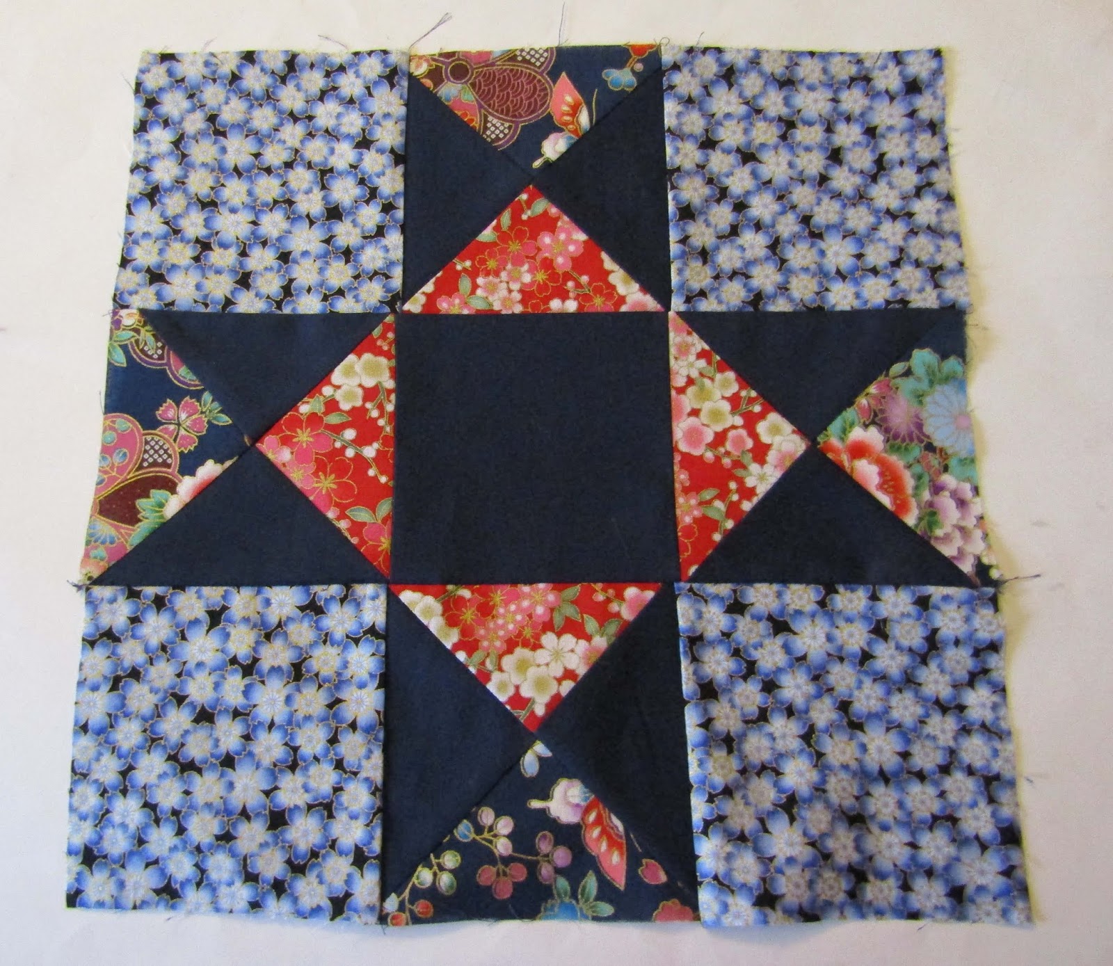
 I have completed the 'Ohio Star' block from the pattern for my first ever patchwork quilt.  I discovered several things from this experience:
1.   I do not like using a rotary cutter.  My ruler kept slipping on the fabric and so I knew that as my cutting was not accurate in the slightest, there was not a hope of my seams lining up, and so it proved to be.
2.   The navy blue contrast material had a surprising amount of stretch in it, which was not helpful when I needed to cut squares diagonally to make half square triangles.
3.   The pattern, although it says it is suitable for a beginner, in my view is a little more challenging than that as it requires quite a bit of rotary cutting (see point 1).
4.    I shall stick to using pre-cuts or jelly rolls for future projects.  (This will remove the issue of point 1).
5.   I shall finish this project as it is a good learning experience, but it will not be perfect in any way.  However, I will still be proud because I made it!
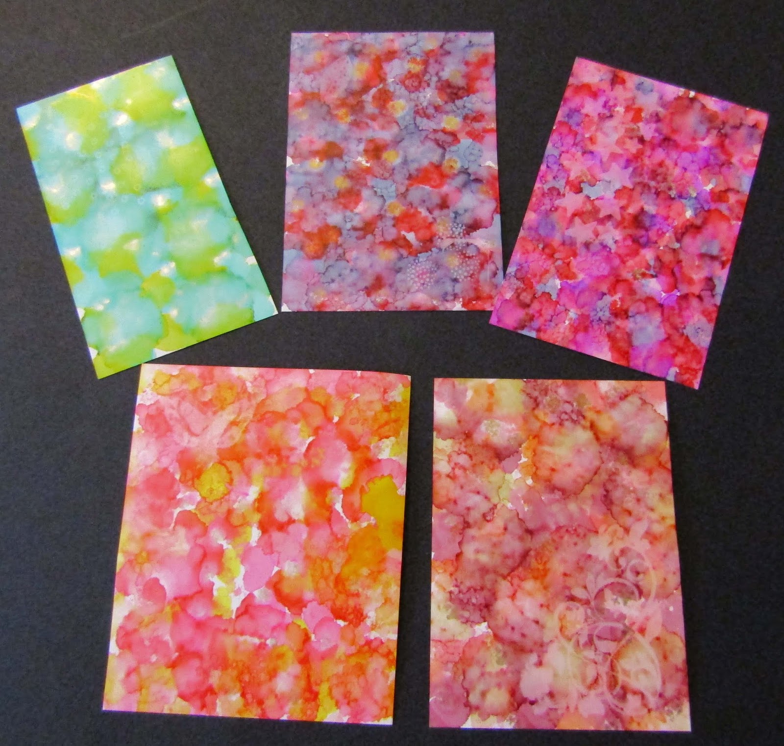
 In other more positive news, I have been enjoying becoming re-acquainted with alcohol inks.  I originally bought them when I was using polymer clay regularly, but since I got sidetracked into other crafts, they had been somewhat forgotten.  I got some Yupo paper (a synthetic paper which the inks sit on the surface of) and some Lift ink, and off I went.  It was exciting to see what the colours would do.  I added some metallics into the mix as well.  I loved the vibrancy of the colours.  (Being alcohol, there are a few safety issues to be aware of - well ventilated room, wear gloves, don't breathe in the fumes and never put alcohol ink or blending solution in a mister to spray - it's flammable and there is resin in the solutions which could get into your lungs). However, all the precautions are more than worth it for the great results (in my opinion).
 These closeups show the effect of the Lift ink, which is applied to a rubber stamp and stamped onto the alcohol ink, holding it on the ink for a few seconds.  The ink lifts off the colour. You can then use the rubber stamp to print onto normal card, which transfers the image with those lovely colours.
The bleaching effect is more noticeable with darker or more intense colours.  I will be doing much more with my alcohol inks now and using what I create in cards and mixed media projects.

Saturday, 12 November 2016

If at first you don't succeed...

You may remember that I was rather excited about a new to me technique to make faux ceramic using polymer clay and liquid translucent polymer clay.  The photo above is from the faux ceramic pendant tutorial and is what inspired me.  The technique looked reasonably simple and I had the polymer clay, liquid translucent polymer clay and alcohol inks, so off I went.
Hmm, not quite what I wanted, so it was a little disappointing, but I analysed why it had not worked as well as I wanted it to.  Here are my conclusions:
  1. The liquid polymer clay (Sculpey) was too thick to pool properly
  2. I had applied the coloured translucent clay on all the raised areas of the images, not into the recesses, which is what I should have done (if I had looked at the tutorial more carefully in the first place, I would have realised that!)
  3. I had applied the liquid clay using my finger so the application was not very precise
  4. There was a matt finish, rather than a glossy one, although this could have been remedied by applying a glossy glaze
So, I decided to buy some Kato translucent liquid clay as I had seen this used on a different tutorial where it could be heated by a heat gun and gave a look of resin, so I reasoned that it would give more shine.  I also bought some Sculpey clay thinner (just in case I wanted to try again with the Sculpey liquid).  I tried again, using the Kato liquid clay.
Here is the Kato liquid clay with one drop of alcohol ink just sitting on it - the colours looked lovely already, so I felt more positive.
I stamped the patterns into the clay and then cured it. Once slightly cool, I took my time and applied the ink/clay mix into the recesses of the patterns, using a cocktail stick so that I had more control. Once I was happy with them, I cured them again and was pleased with the result - the liquid clay was glossy and did look a bit like a ceramic glaze.  This is a technique I shall return to as I would like to work on an idea using polymer clay and gemstones.
I have also been stamping on polymer clay using my Blockwallah stamps and the results have been great.  I used the StazOn ink, which smells of marzipan when you use it, and which can be used on pretty much any surface.  It worked well on polymer and gave a nice clear impression.  More stamping to come, I think, and I have been looking at some colouring pens which work well on polymer clay, so I think there will be more experimenting to come...

Tuesday, 25 August 2015

Faux Dichroic glass experiments take two... some unexpected results

I had another go at the faux dichroic glass technique and still couldn't quite manage to keep the rich colours of the alcohol inks as I had wanted to.

I used the translucent clay with the inks dripped onto it, which created some dots of colour.
I then used the scraps to make various beads and I think these were the most successful things I made from this technique.  The colours showed through more effectively and the foils gave a shine through the layers. The effect was a little like mokume gane (click here for a previous post about that technique). I think this larger bead may become a centre of a tassel necklace with peridot, aquamarine, amazonite and apatite. 
 You can see the colours much better in the beads.
 These beads were made by twisting the colours together and this gives another effect.  So, although the technique I tried originally didn't turn out as I wanted, I did gain some rather lovely foil beads to use in jewellery. Not a total waste of time then!

Saturday, 7 September 2013

Polymer clay with alcohol ink and stamps experiments (and news of a giveaway at millefeuilles.blogspot)

 Here are my latest designs using polymer clay, stamps and mica powder.  However, these are a little more special because...
...they have interesting things on the back!  I used alcohol inks to make the marbled backgrounds and then stamped with pigment ink once the alcohol ink had dried a little.
 I tried other base colours and textured stamps to see what the effect would be...
 ...and made the backs more interesting, using stamps and the alcohol ink.  I was really pleased with how these turned out and have ordered some more alcohol inks in blues and yellows to play with too.  I need to finish these by sanding down the rough bits and then giving them a coat of varnish (matt or gloss - haven't decided yet).  I can see I shall be doing a lot more experimenting...

On a completely unrelated subject, Stephanie, over at millefeuilles is having a very special giveaway.  She creates the most beautiful hares, rabbits and mice using vintage French fabrics and her own beautiful and delicate embroidery.  I am in awe of her workmanship.  The exciting thing is that you could win one of her beautiful creations - this meadow hare (she has given permission for her photos to be used).
Isn't she gorgeous?  If you don't win (and I think there will be many, many entrants!), you can also commission her to create a special one-off hare/rabbit/mouse for you.
Have a lovely weekend.